I really like a well crafted, usually minimal, logo or branding.
Post your favourites, can be anything.


I really like a well crafted, usually minimal, logo or branding.
Post your favourites, can be anything.
…the logo is essential to a BRAND…
i love it…and i’m also all in for simplicity…
came up with a few along the way…but can’t post them without dropping my anonymous pants here, though…
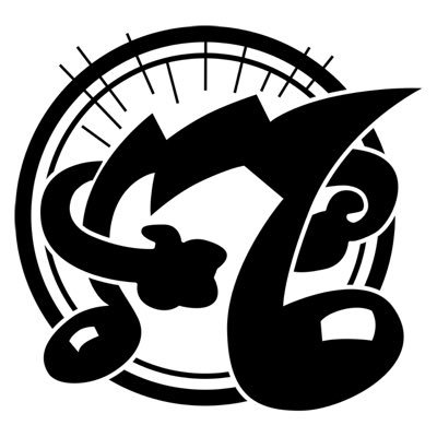
only recognize the most obvious here…nin…what about the rest?..ur designs?
that backlooking swan meets old school pencil meets strong arm posing is cool…
but gets a little blocky to the right bottom end…if we’re talking full blown esthetics here… 
Oh oh. A sensitive topic.
Intellijel = Canadian Eurorack
Fallen = skate stuff
S = British Steel
Swan thing = Cygnet Publishing, very clever that one
…and speaking of sensitive…
as much as i love elektron…i never liked their logo…
their overall graphic approach is cool…and even funny cool…
but their logo…nay…not my cup of tea at all…
yeah…come on…hit me…
Love Independent Trucks’ redesigned logo…

For that matter, I’m super into the study of redesigns. There’s a great Indiana based blog that covers a lot of them:
https://www.underconsideration.com/brandnew/
Oh I like that…
[EDIT] having browsed more there are very few logos not improved by a redesign. Interesting.
It’s the perfect balance between new and retro.
…nice resource…
closing in on sonic brands…i hate akais rebranding efforts…
while oto remains timeless…
really ask myself from time to time, why i’m so into logos and at the same time be the one who always duck tape them away all around me…even if they’re cool…
i mean…hey…the first thing i do after unboxing any gear is going for a matching colour duck tape to cover the brands logo on it…
Always loved the Oberheim logo
Totally. If Kool-Aid Man was a synth nerd!
As a Chicago White Sox fan, I love their last two logos the most.
Haha same!
…ooops…they seem to change their logo almost as often as they change their underpants and sox…
but if u want white sox, u just have to…i guess…
and @Octagonist - so, what’s the FedEx trick?
OMG!!!


AAAAAAAAHHHHHH
this is a complete sentence you robot bastard.
I had a similar experience with the carrefour logo. I always thought there was just an arrow, until someone pointed out the letter “C”.

I love how they didn’t make it the main part of the logo. It’s almost an “Easter egg”.


